Council worked with the local communities, who provided their ideas, concepts and themes which were incorporated into three designs for each community to choose from.
Congupna’s inspiration came from the Aboriginal definition of the towns name meaning ‘Big Fish’ which cleverly features a fish in the words Congupna. The bright yellow background signifies the crop harvest, and if you look closely, you can see the railway line in the background. This is to recognise the history of the busy railway station that operated in the area.

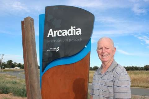
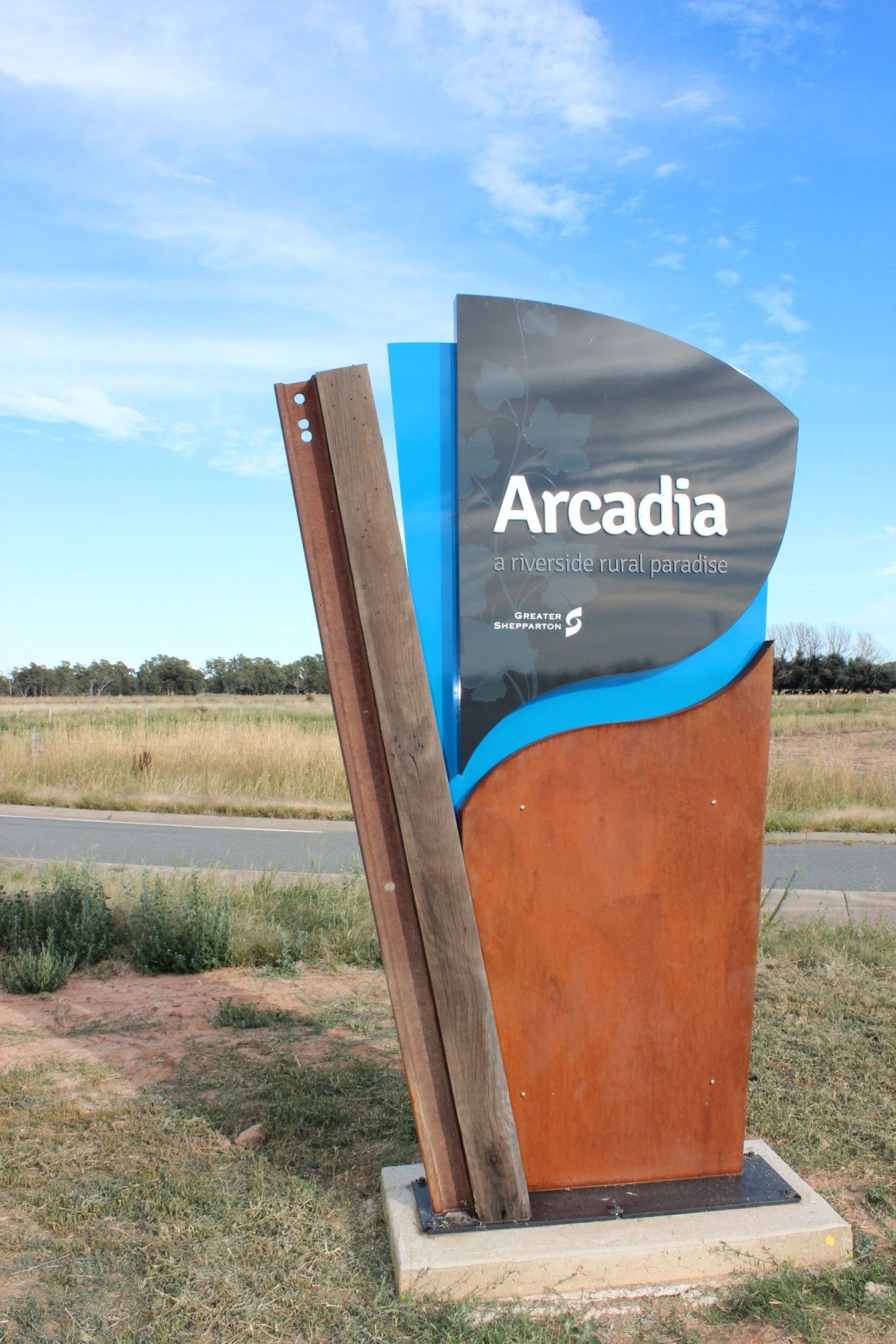
The history of Arcadia’s railway station was a popular theme for their community with the wood representing the original railway stations structure operational in the town from 1880 – 1977. Also featured are the vines that grew on the stones of the station platform and the blue river flowing along the east boundary.
Council’s Manager Neighbourhoods Amanda Tingay congratulated everyone who had been involved in the project.
“These signs reflect the history and culture of the local communities and it is great that this project has been driven by the local communities as part of their relevant community plan,” Ms Tingay said.
Arcadia Community Planning Committee representative John Kennedy said it was a great effort from the community to collaborate and bring together all the aspects of the design. It’s not only a good indication of where Arcadia is while travelling along the GV Hwy, but also a fantastic reference to the town’s history.”